Bedroom Moulding Design Feature Wall

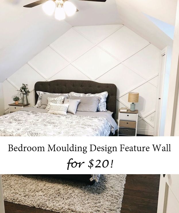
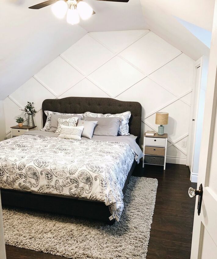
Check out this easy bedroom feature wall that only costs around $20! This project can be made into any pattern or colour of your choosing and requires minimal supplies. Transform your bedroom with this fun one-day project!
Hometalk Recommends!
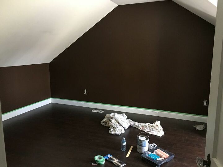
Here's our master bedroom when we moved into our home. It felt so dark and small... will it even fit our king size bed? I guess we'll find out!
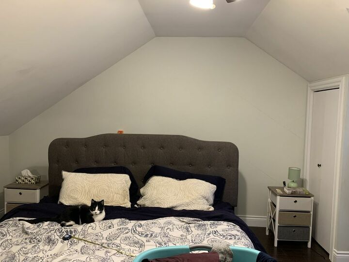
One of the first things we did when moving in was painting this bedroom. This "sea salt" colour paint made the room feel twice as big!
Clearly our king bed DID fit and our cat, Jasmine, is enjoying the room as well!
After a few months, I decided that this room could use a feature wall. The sloped ceilings made it a little difficult to decide what would look good. Maybe a stencil or wallpaper? Or maybe a moudling design!
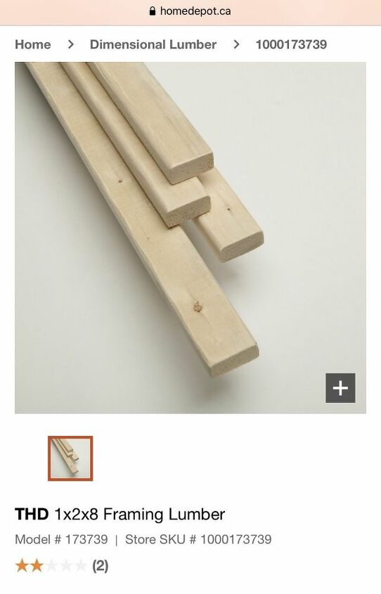
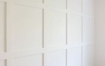
I decided to go with a diamond moulding design. I knew that I could achieve this easily by using some 8' framing lumber. First, I lightly drew the pattern on the wall and measured how many pieces of wood I would need. Then, I headed to Home Depot and bought 8 of these 1"x2"x8' boards.
Since this is a small room, I went with a white for the feature wall. I think that a dark accent colour would look awesome for a bigger room, but knew that going darker in our bedroom would make it look smaller again.
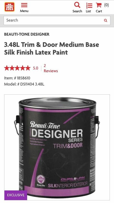
This is the paint I used from Home Hardware's Beauti-Tone line. I started by painting the wall with one coat. (I used less than 1/4 gallon)
Next, the boards were painted with one coat of the white paint before putting them up.
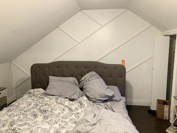
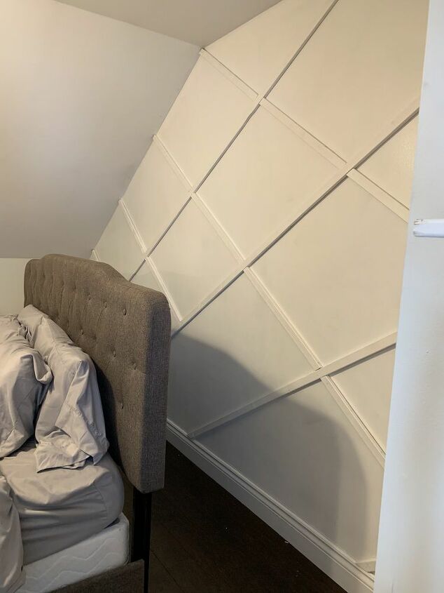
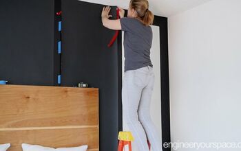
I used the awkward sloped ceilings to my advantage by using their angle for the diamond pattern! Each board is nailed to the wall with 2" finishing nails.
Almost done!
After all the boards were up, I did a second coat of paint on the wood pieces to cover up the nails.
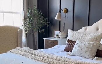
Voila! Our master bedroom feels so cozy and spacious with this fresh coat of white paint and new feature wall!
For more ideas and ongoing projects, follow along on Instagram and Facebook!
Insta: @farmhouse.ongunnshill
Facebook: Lauren Ann Design
~Lauren 
Enjoyed the project?
Resources for this project:
See all materialsComments
Join the conversation
-
 Omaifi
on Nov 20, 2024
Such a simple yet effective way to update a bedroom! Thanks for sharing! I love how customizable it is, from the pattern to the colors. It's a perfect weekend project that won’t break the bank. I’ve done something similar in my own home, and the transformation was amazing. If you're looking for more inspiration for your home, I’ve also seen great ideas from Meritage Homes reviews that talk about affordable upgrades for living spaces. Little changes like these can really make a room feel fresh and personal without spending too much.
-
-
 Kay26346132
on Jan 09, 2025
Great idea to put focus on awkward wall instead of trying to hide it. Looks amazing.
-








Frequently asked questions
Have a question about this project?
That wall looks really nice! Curious, why isn’t the bed centered on the wall?
That is fabulous
It is amazing. It made it look bigger. Great Job.👍️♥️